The History of Web Layouts
Web design and development has evolved a lot in the last thirty years. We started in the mid-1990s with table-based layouts, spacer gifs, and desktop-only design (nobody had smartphones or mobile data). Moving forward, we started to see Flash-based websites, which were (and still are, but you shouldn’t be using Flash, so no worries, right?) super vulnerable to exploits. These websites were capable of a TON of things that standard HTML just wasn’t capable of at the time, which made them super appealing, both for users and from an aesthetic standpoint.
Continuing to move forward, we see the early beginnings of usability-focused designs with the increasing support of CSS in the early 2000s. This brought about a period of greater freedom for everyone involved, because content could be generated independently from the design, allowing for a lot more creativity, better use of white space, use of icons, and a ton of other features we still see in modern web design and development.
These are only a few of the major hurdles we’ve seen in getting to the Web 2.0 and HTML 5 specifications that we use today, and boy were some of them an absolute (but necessary) trainwreck. This brings us to modern web design and development standards: floats and clears, inline-block display elements, flexbox, and grid. Excluding frameworks and JavaScript-driven layouts—mostly due to the fact that it would take us way too much time to touch on every one of them (and another is bound to get released before I finish anyway)—we still have a weird mish-mash of different ways to create similar layouts, some of which work much better than others.
Our Experience with Web Layout “Hacks”
Working at Armor, we’ve had an opportunity to work with a lot of these modern, vanilla-CSS methods for layouts. Working with floats is great—except that those floated elements don’t take up space within their container. The solution to this was to add a clearfix, or an element with no content that lived in the bottom corner of the container, forcing it to contain the elements above. Then, we moved toward an inline-block system, that forced elements to sit next to each other until there wasn’t enough space, and then drop to the next line. This is great, but it locks the developer into the DOM structure they’ve created. Do you want to move a piece of content above on smaller screen sizes? Too bad—without JavaScript or some hidden elements—it’s impossible. Do you want to change the layout’s sidebar to the footer? Well, unless it’s explicitly placed there in your DOM structure, you’re out of luck.
 Without the “Clearfix” mentioned above: the blue box doesn’t take up space with respect to its parent container (The red bordered-box).
The problem with these layout methods is that they think in a one-dimensional space. You either have a column or a row, but not access to both within the same container. So your layouts reflect this and have limited ability to break out of these molds. That brings us to the topic of this post: CSS Grid.
CSS Grid: The Prodigal Method
CSS Grid is a relatively modern CSS library for layouts, with the core support for it starting around 2011. It was originally a proposal sent to the CSS Working Group from Microsoft, and it was originally a feature that shipped with Internet Explorer 10 as a core component. Fast forward to late 2017, and (almost) all modern browsers now have support for CSS Grid. But what is this layout, and why does it differ from its predecessors?
Well, CSS Grid is a modern layout system that allows for developers to create an invisible grid on the page, and to then place the content within that grid in arbitrarily created “cells.” The big difference between this and layout systems of olde is that you can create rows and columns for your layout, allowing for a 2-dimensional layout protocol that we’ve never had access to before.
Now, I’m sure you’re saying, “Sure, that’s great an all, but how do I use it, and how does this benefit me?” Well, my friend, this benefits you (the developer) by making it infinitely easier to create the crazy, ever-changing layouts that your designer creates for your clients. It benefits you (the consumer/client) by ensuring that on basically all devices, your site is going to look the best it can, and the relevant information will surely be displayed prominently. It also ensures that the work to accomplish this takes significantly less time, allowing for flashier, more polished, and overall, better quality websites that are easier to edit, both on a content- and a layout-level.
Using CSS Grid
As for using it, well, that’s another blog post entirely. What I can do here, however, is give you some resources to understand and start working with Grid today. First, here is a tutorial game called CSS Grid Garden that will help you to get familiar with the new CSS calls, and how to utilize them effectively. Second, here’s a link to a pseudo-interactive cheatsheet that will show you all of the CSS rules in relation to their element (whether it’s the parent “container,” or an element inside, “child”).
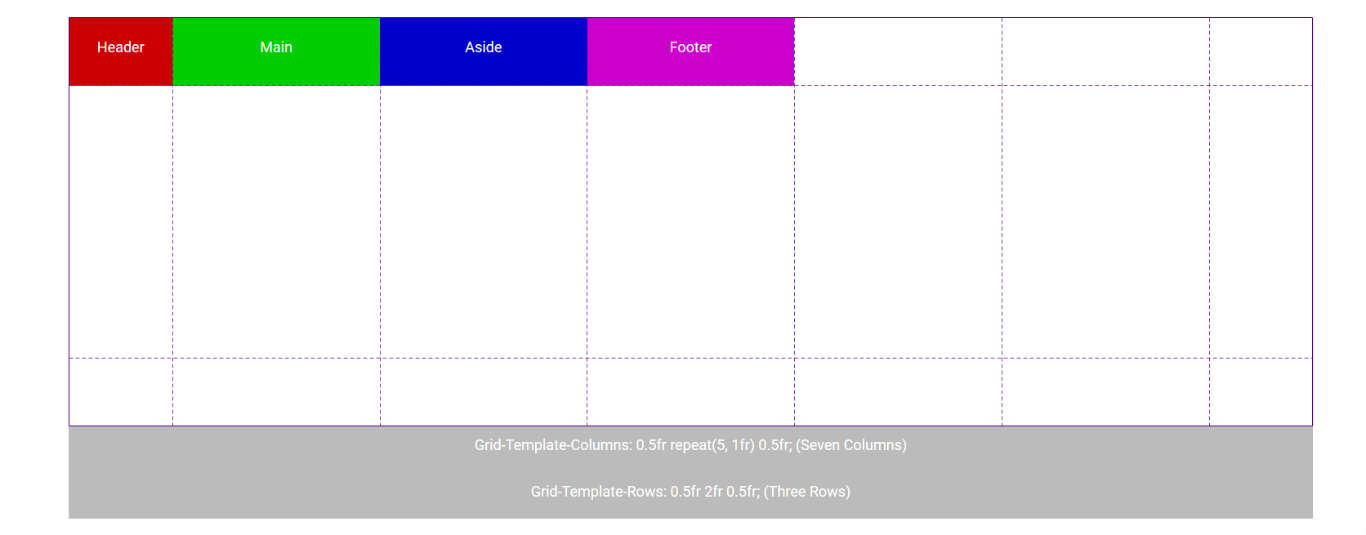
 This is a basic grid layout without any styling. Notice how the content fills “cells” sequentially, from top-left to bottom-right.
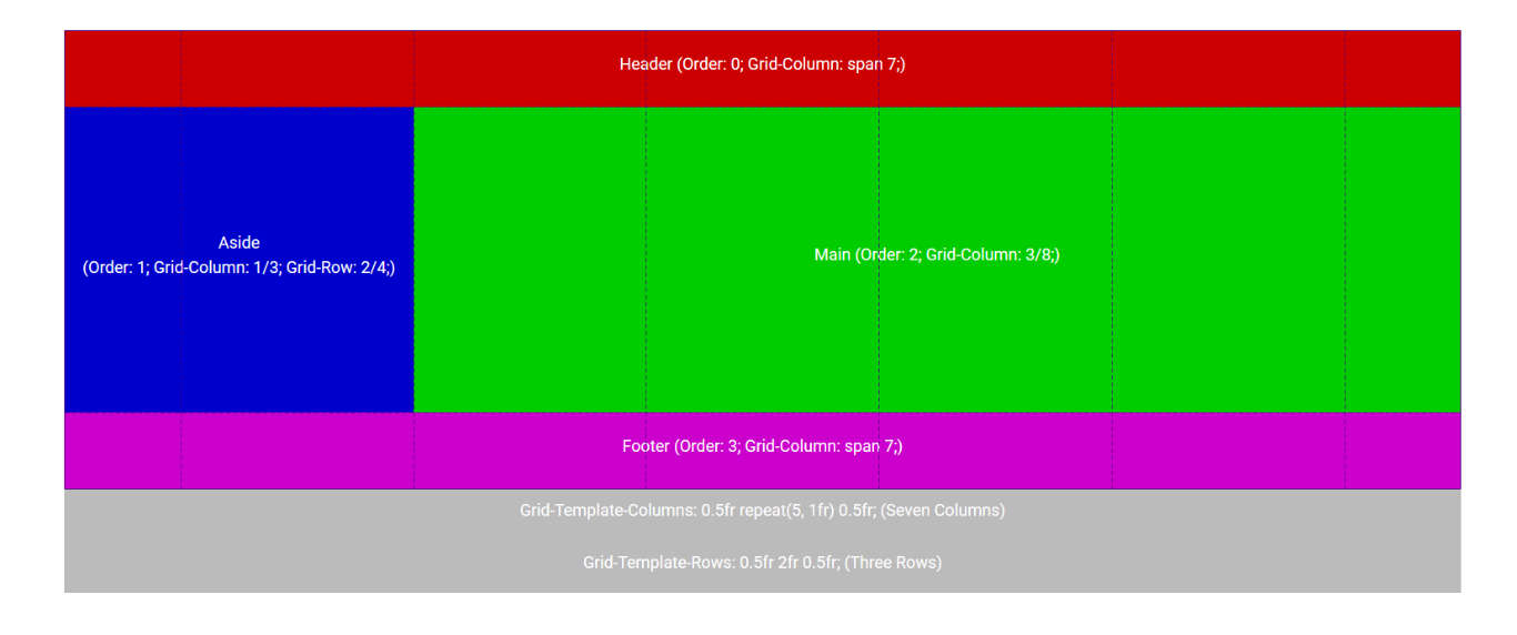
 And this is the SAME grid layout with styling. Notice how the content was reordered to fit the layout (Aside comes before Main).
Otherwise, the best advice I can give to the developers reading this post is to just do it. Jumping right in has always been the fastest way to grasp CSS—and since all you need is a computer (not even an internet connection) to test HTML and CSS pages, it’s a no-brainer. As a side note, I recommend working with CSS Grid in a Mobile-First environment, as most of the content you put on the page won’t need very much styling on a mobile device, and your grid will probably only kick in around tablet screen sizes.
Why You Should be Using Grid
Now, the use-case that helps to prove my point. On a recent project, we decided to implement CSS Grid instead of our normal framework stylesheet. The first thing we did was create all of the HTML elements (DOM). Now, this part was the hardest step for us, as we had to move away from the bad habits that the previous layout methods taught us. You no longer need containers around content to lay them out, and you don’t need clearfixes, floats, etc. Once the DOM was created, we added the basic styles (fonts, colors, background elements, etc), and our mobile website was done.
Then, after expanding to the first tablet screen size, we implemented grid and hit the ground running. Creating a grid layout that had four columns across, all we had to do was tell the content which “cells” it lived in. Since we weren’t bound by the containers of our old layout system, it was relatively easy to accomplish. Grid allows you to work top-down (literally) through the content, so first, we spanned our heading across the top of the website under the header across all four columns. Then, the subheading was next, followed by a section split into two separate columns. Simply telling the first piece of content “span 2” columns, and then the second to also “span 2” columns, they sat nicely next to each other, filling half of the available space, and accomplishing the layout we required. Before CSS Grid, this process would have involved two containers set next to each other, whether floated, inline-block, or flex’d across, which limited our ability to move them later, but with Grid, it was as simple as choosing cells for the content, and telling them they live there.
Moving to larger screen sizes, we just told the content to span fewer columns so more than two elements could sit next to each other. Increasing the grid to five columns also allowed us to leave some of the grid “cells” empty, easily placing whitespace on the site that looked clean, worked with the rest of the design, and didn’t impede our ability to properly and effectively style the content, and move it around as we saw fit.
After all was said and done, our stylesheet’s file size was nearly cut down to 1/4 of what it was.
Think about that: one-quarter of the data is now required in order to render the webpage. What’s even better than that is that by using Mobile-First, only a chunk of the stylesheet needs to be loaded at smaller screen sizes, making your pagespeeds even faster, for no additional cost or work on your part. Just the decrease in resource requirement, and the increase in pagespeeds, should be enough to pique the interest of the optimization-focused web developer; coupled with the additional time saved, should convince the consumer that this the choice for modern web layouts.
