What Is the Difference between Text, Font, and Typeface?
Typefaces are important to designers because they can make or break a design. When creating a design, you have to be aware of who your target audience is and what you are designing for. If I am designing a sports car logo, then I’ll use a sans-serif typeface, not a bubbly one. One of the major problems, when talking about type, is when people mix up the terms text, font, and typefaces. These three little words have very different definitions regarding the same topic, so let’s define our terms.
Text is written/printed work, regarded in terms of its content rather than its physical form, i.e., the words. Font is a graphical representation of text characters in a specific family that may include different typeface, point size, weight, color, or design. The word font is derived from Middle French fonte “a casting,” the term refers to the process of casting metal type at a type foundry. It is a set of printable or displayable text characters in a specific style/size, e.g., 12pt Helvetica Light Italic. Typeface is the type design for a set of fonts and variations of this design form the typeface family. Helvetica, Futura, Gotham, and Lato are popular typefaces people use in 2018.
However, that is just scracting the surface on fonts—there are over 100 different aspects of typography.
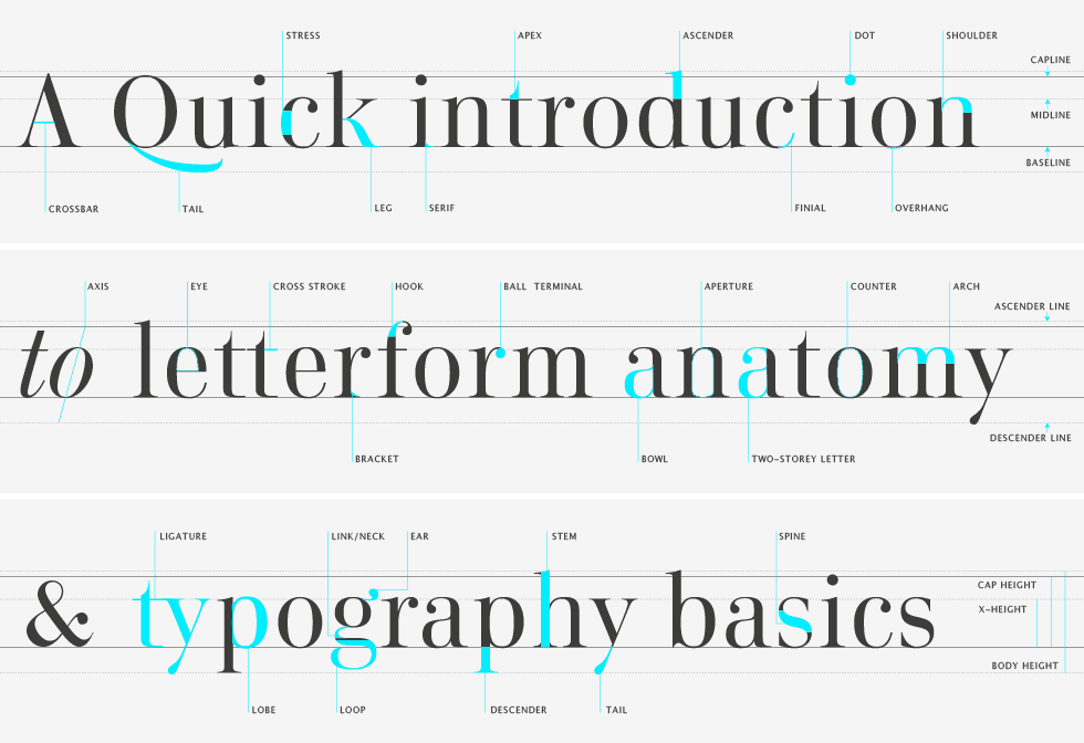
 Here is a glossary for type. The image is a link that will take you to a website that defines type in more detail
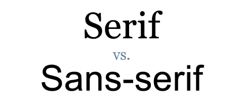
Serif vs Sans-Serif Fonts
Eventually, after looking at so many different typefaces, you’ll be able to recognize them at a glance, but here is a secret, you already know one font because you see it every day. Helvetica is used on phones, stop signs, and is the default typeface for signs and websites. This font on this webpage is Lato. These fonts are examples of sans-serif. Sans-serifs are simple text: they do not have tiny little feet or any decorative elements along the stem, tail, and leg. The term comes from the French word sans, “without” + serif.
Sans-Serifs are more modern and minimal than the serifs. Sans-serifs are very important because they make the reader slow down. Sans-serifs are also better at smaller sizes than serifs. A page full of sans-serif characters looks less messy than a page full of serif characters. Sans-serif is also more versatile. Children and older people tend to prefer sans-serif because of it’s simplistically. There are no extra extrusions for the reader to get confused by. Today, about 70% of website headers and body text is sans-serif.
 See how Serif has little feet and Sans are smooth
 Serifs are considered to be decorative. Their appearance serves a higher purpose than sans. Serif typefaces have historically been credited with increasing both the readability and reading speed of long passages of text. This is because serif characters have little extrusions to help the eye travel across a line, especially if lines are long or have relatively open word spacing. Though, not every serif typeface is more readable than a sans-serif one; you have to be careful about how much you are putting on the page and how small you make the font.
DPI (dots per inch) is also a factor when talking about text. Let’s take an inch and look at what we are reading on. Computer screens have 100dpi, tablets and most smartphones have about 300dpi, and printed materials have 1000dpi. This is important because serifs are hard to project on screens with the smaller dpi. People can get motion sickness from trying to read serifs fonts on a computer screen. This happens because of the natural movements that people make. It’s why you can tell the difference between a handheld camera and a stationary one. So designers try to stay away from serifs for the body text.
How to Pick the Right Font
In the graphic design world, there are a handful of fonts that scream “I DON’T KNOW WHAT I’M DOING!” Here is a list of typefaces that are a big NO-NO; Comic Sans, Arial, Franklin Gothic, Bleeding Cowboy, Papyrus, Curlz MT, Bradel Hand, a song for jennifer. I would avoid these typefaces if you want to be taken seriously. These fonts are either overused, have bad kerning, bad spacing, disproportional lining, or are missing other details.
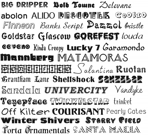
When looking for a font, you need to know what you want to be looking for. Serif and sans-serif is only the beginning: the type you pick is important. Here are a few that I’ve seen used recently: dot, display, script, round, stencil, decorative, square, gothic, monospaced, script, and geometric.
 Here are 40 fonts all together so you can see all the different “Types”
Then, after you find the font that you want to use, you have to make sure that you have the license to use it. Remember that real people made these fonts, and just like with music or images, they have a right to their font. Every font has a license: they are either 100% free, free for personal use, and Demo. 100% free fonts are fonts that you can use for industries and personal use. Personal use fonts are fonts that you can’t use to make money or sell them are part of an offer. Demos are usually paid fonts that have watermarks in them.
But don’t worry, the internet has provided you with thousands of free fonts. Don’t have the time to become a typography expert? No worries, here at Armor, we’ve got you covered.
If you like this post, or have any blog topics you would like us to cover, contact Armor Techs to let us know! We love to hear your feedback on how we are doing.
